Responsive Web Design
AutoFlow AI

The Brief
AutoFlow AI is a new marketing agency that helps businesses optimize their marketing using Artificial Intelligence. They aim to help businesses get 10x more done, with less human effort.
My task was to design a quick MVP of AutoFlow AI’s website so they can establish an online presence and get more clients.
Timeline:
- 5 Weeks
Tools:
- Figma
- Balsamiq
My Roles:
- UX Research
- UX Design
- Branding
- UI Design
- Usability Testing
- Copywriting
Unique Challenges
1. Short timeframe – I had to go through the whole UX process within 5 weeks (while simultaneously working on 3 other UX projects).
2. New problem domain to learn about – I had to quickly familiarize myself with how AI can be used for marketing. This meant doing online research and asking plenty of questions to better understand the client’s services.
3. I was the sole designer in this project – I had to create the end-to-end product entirely on my own.
4. Branding and copywriting from scratch – The client was initially planning to provide all the branding and copy, but he did not end up having enough time to do it. So I had to create the branding from scratch and write all the copy on my own.
Research
Stakeholder Interview: Uncovering Assumptions
Throughout this project, I worked with one main stakeholder – the agency’s founder.
I began with an in-depth stakeholder interview to better understand AutoFlow AI’s USP, business goals, services, and uncover any assumptions that the stakeholder has about his target audience.
I discovered that the client had 2 key assumptions:
- Business owners believe that AI is the way of the future, and whoever uses AI will be ahead of the game. They don’t want to fall behind.
- Business owners would see an advantage of hiring an AI-powered marketing agency over a traditional marketing agency because they see AI as “powerful.” They believe that AI can help you get things done faster and better.
Next, I conducted user interviews to find out whether these assumptions were true about AutoFlow AI’s target audience.
User Interviews: Key Takeaways
Over the course of 2 days, I conducted 5 user interviews to find out:
- What are business owners’ attitudes, perceptions, and hesitations about hiring AI-powered marketing agencies?
- What do they already know about how AI can help marketing?
- What are their true attitudes about AI in general?
I discovered that business owners generally agreed with the client’s assumptions, but with some caveats:
“AI feels like a buzzword. Everyone is talking about it - but does it actually do what it says it does? I honestly don’t know.”
Interviewee
“If I had to decide between 2 marketing agencies, I wouldn’t be super impressed with the AI aspect.
If you can bring the costs down, maybe, but I’d have to see real numbers and a case study on that. Maybe the marketing agency I previously used was already using AI. Who knows. Doesn’t matter to me. Results are what matter.”
If you can bring the costs down, maybe, but I’d have to see real numbers and a case study on that. Maybe the marketing agency I previously used was already using AI. Who knows. Doesn’t matter to me. Results are what matter.”
Interviewee

The Stakeholder’s “Shocked” Reaction
I organized all my findings into an affinity map, and presented the key findings to the stakeholder. He was “shocked” and very grateful for these insights:
“Wow... I’m shocked by everything I’m reading. I’m shocked by how people are so not understanding of AI and think its just a buzzword, even though it's revolutionary...
"This is so, so useful that you did this. I'm going to have to change up my whole approach to marketing this - at least for small businesses. It seems like the average consumer is really not getting this... This is very useful. Thank you!”
"This is so, so useful that you did this. I'm going to have to change up my whole approach to marketing this - at least for small businesses. It seems like the average consumer is really not getting this... This is very useful. Thank you!”
Y.K., Owner of AutoFlow AI
User Persona
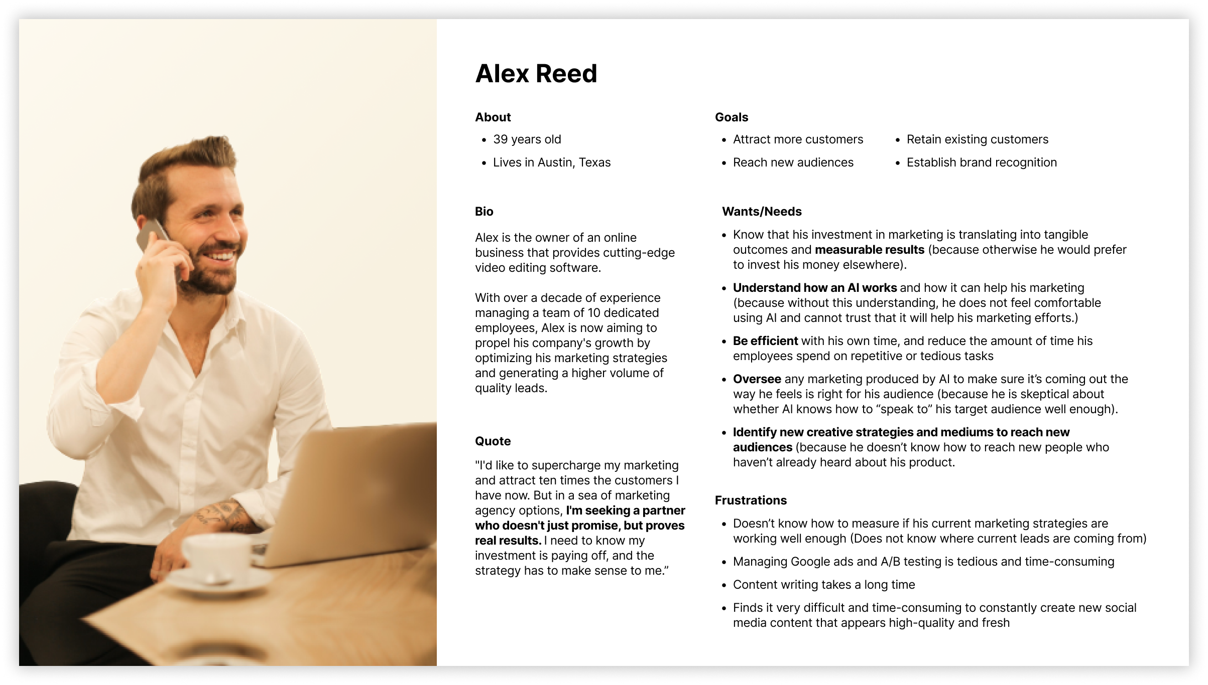
Next, I compiled all my research findings into a user persona. This helped me get a clear picture of what type of person would be most interested in AutoFlow AI’s services.
Based on the research, I determined that the ideal client would be someone who has an online business that offers a digital product or service that can be easily scaled (without requiring more manpower), since one AutoFlow AI’s main services is exponential lead generation.
Also, I realized that the ideal client would need to have a medium-sized business because if their business is too small, they probably would not have a large enough marketing budget to hire AutoFlow AI in the first place, and to handle more leads.
Ideate
Brainstorming & Competitive Analysis
Now that I had identified the user’s main motivations and hesitations, I wrote the following two “how might we” questions to begin brainstorming:
Next, I brainstormed many ideas of features to include on the website that would address these two concerns.
I also did competitive analysis – I looked at other marketing agency websites and AI-related websites to see how they addressed these issues.
Finally, I presented my ideas to the client. Together, we selected which ideas to include in this initial MVP version of the site.
Solutions for Showing Measurable Results
This was difficult issue to tackle because AutoFlow AI is a relatively new business and does not yet have so many measurable results to showcase.
However, I came up with some ways we can address this issue in the meantime:
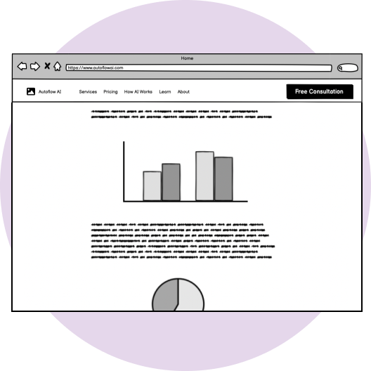
Display numbers, charts and
data visualizations
Highlight client testimonials
that mention AutoFlow AI’s impact

Showcase AI’s impact
through case studies
Solutions for "Don't Understand AI"
This was also a difficult issue to tackle, because I myself did not fully understand how AI works and how it helps with marketing. So I did a lot of online research and spoke to the client to better understand his services and processes.
Here’s what I came up with to address this need:
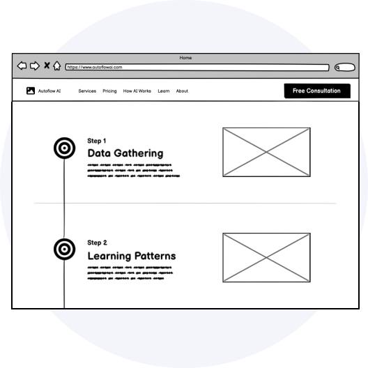
Include a page for
“How Does AI Work?”
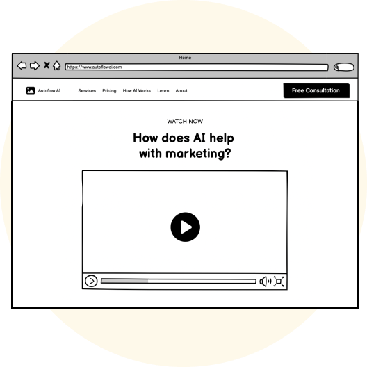
Create an explainer video
about how AI works
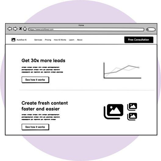
Use simple language –
not too much jargon
Prototype
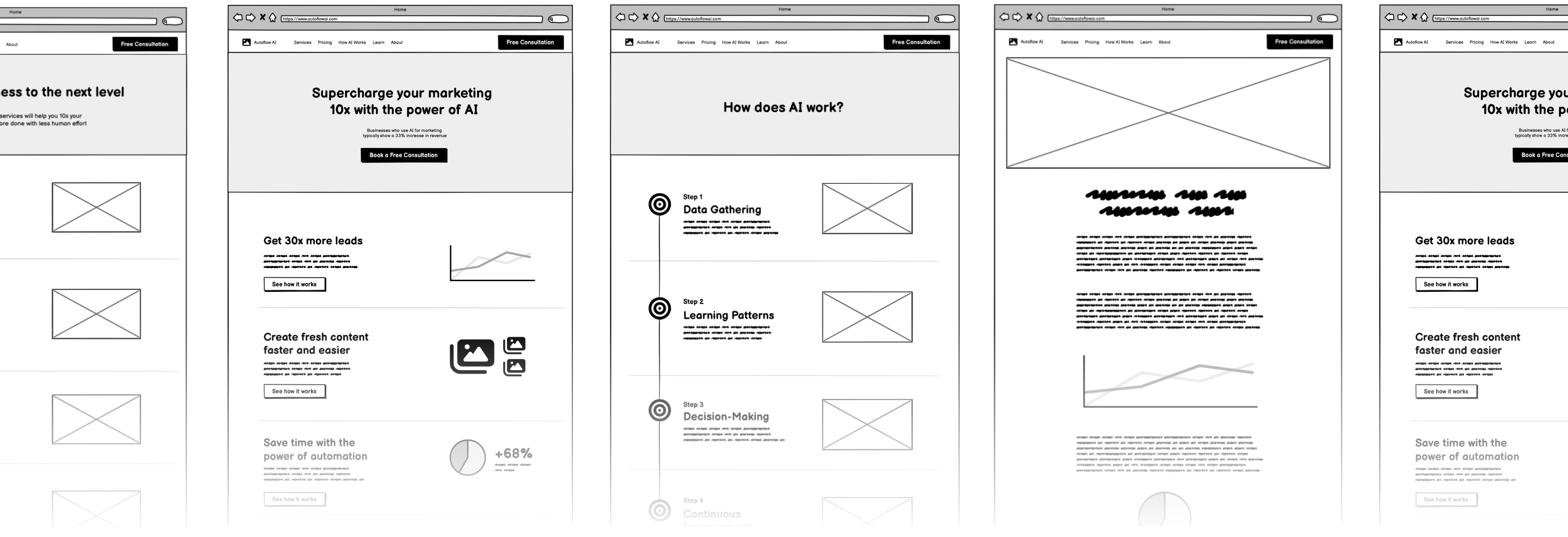
Low-Fi Wireframes
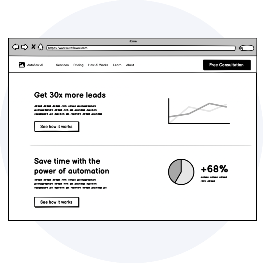
Once I had a plan for which features to include on the site, I drew low-fi wireframes for desktop and mobile, and showed them to the client to get his initial feedback.
Working on these wireframes helped me identify some key questions to clarify with the client before moving forward – such as how he prefers new clients to contact him, which services he wants to highlight, and how he wants to present his pricing model.
The low-fi wireframes helped me quickly sketch out the pages and general content without getting stuck on the details.
Mid-Fi Wireframes (including all copy!)
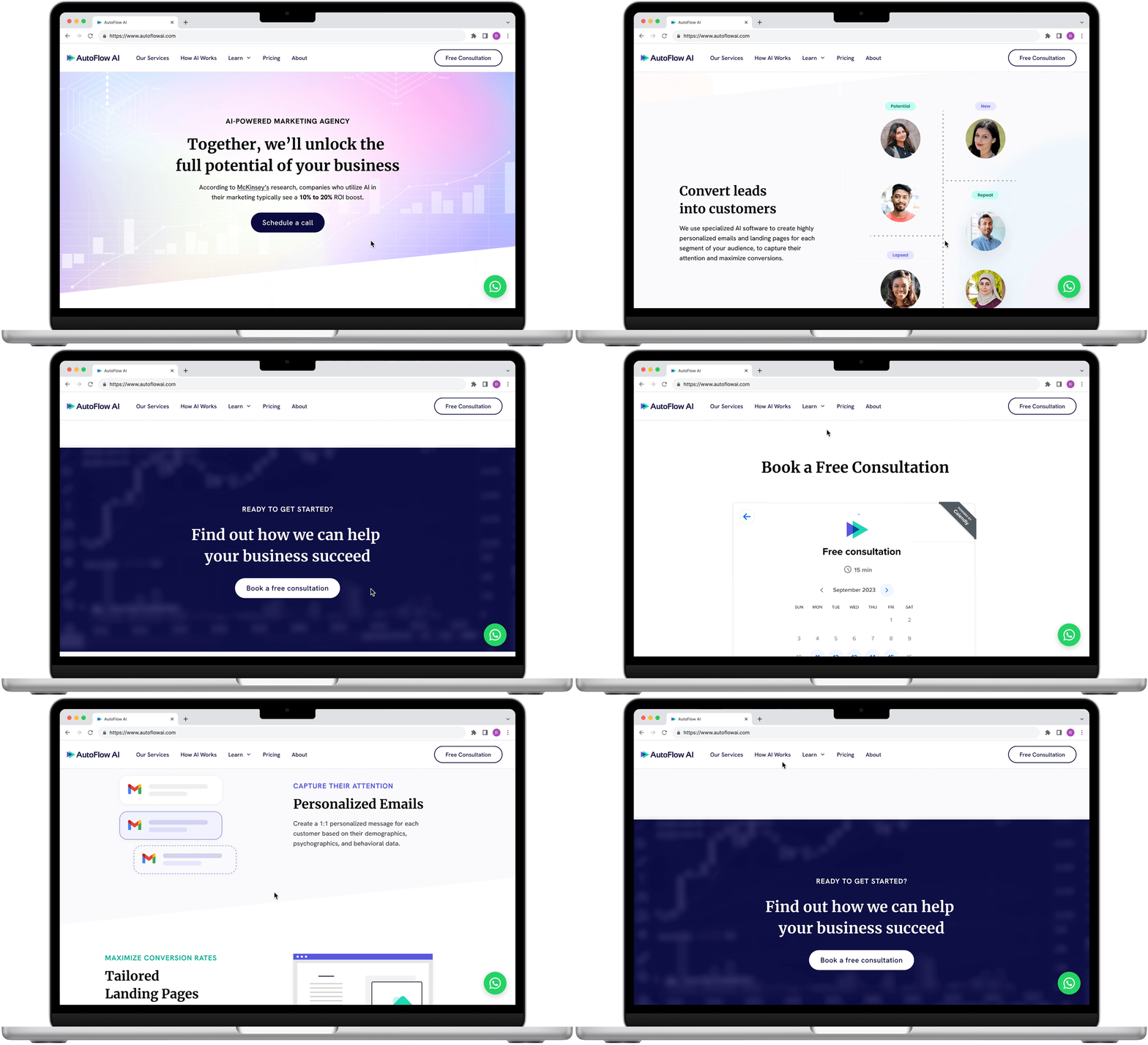
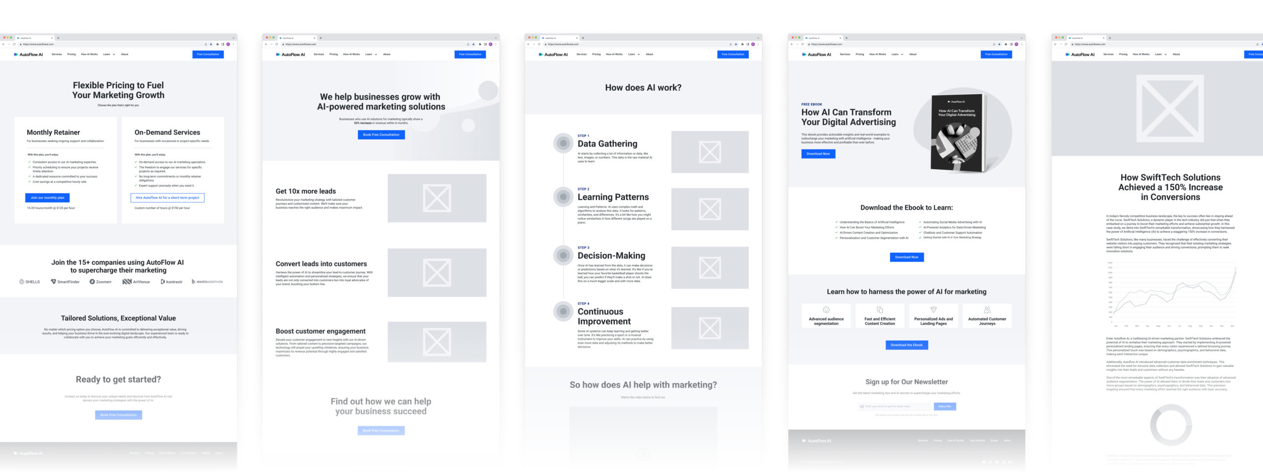
Next, I created mid-fi wireframes.
At this point, the client was supposed to send me all the copy, but he ended up being too busy to do it, so I had to write all the copy myself.
I used Chat GPT to help generate some of the copy (this was an AI project, after all!) but I still had to do significant amounts of editing to get everything to sound right.
Testing
Short on Time: Tested with Mid-Fi
Since I was on a tight timeline, I decided to do the user testing with the mid-fi wireframes so that I could get feedback and make iterations as quickly as possible, before spending too much time on the hi-fis.
I conducted 5 usability tests via Zoom screenshare within a few days.
What Went Well
Looking back at the 2 main research insights I was trying to address, I was happy to see that some of the solutions I included on the website were appreciated by the test participants.
“This is great. I’ve never seen something so broken down about what AI is. It definitely makes me feel more comfortable [using AI for marketing].”
Usability Test Participant
Key Findings from User Testing
There were 2 main issues that came up during testing which I was able to address before turning the mid-fi wireframes into high-fi designs:
3/5 Participants thought AutoFlow AI was software, not an agency
- To fix this, I used more “agency” type of language (e.g. “Our services”) and added copy to the homepage which made it clear that this is an agency.
2/5 Participants wanted more ways to contact (besides the free consultation)
- To fix this, I added contact information to the footer, as well as a WhatsApp chat.
Additional Issues Flagged
There were several more issues that came up in the usability testing which were out of scope for me to fix, since they related to how the clients wants to set up his business (which he was still figuring out).
I therefore flagged these issues for the client to address in the future, as he continues to solidify his business plan and tweak the website copy:
Branding
The client was originally planning to provide the branding – but he didn’t end up having enough time to do it, so I designed the branding myself.
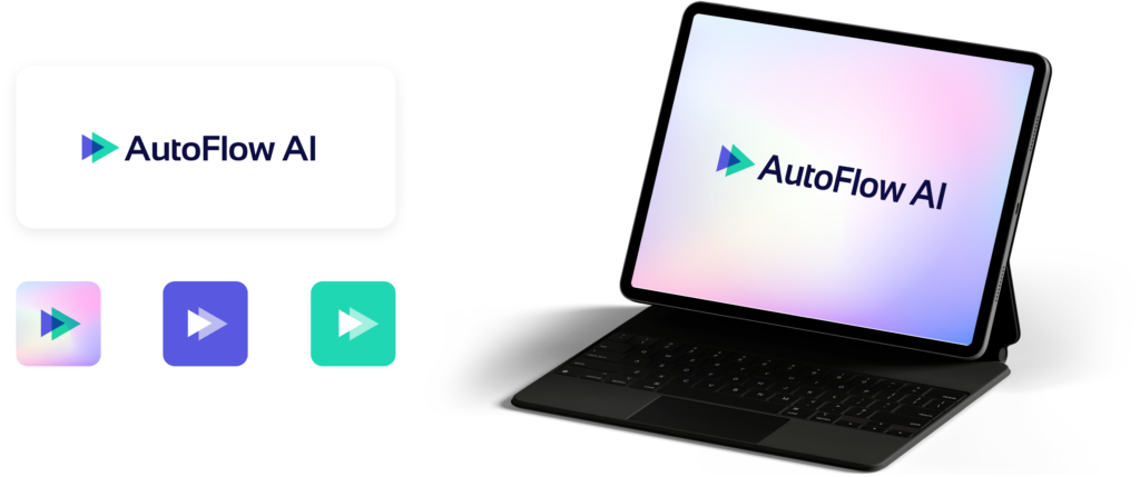
Logo
For logo inspiration, I looked at other AI brands and noticed that many use simple shapes, semi-transparent overlays, and bright neon colors.
I chose to work with a triangle shape because it represents flows and funnels, and it also gives a sense of movement and efficiency.
Typography
At first, I considered using a modern, “techy” sans-serif font because this is an AI-powered agency. However, I realized that this font might exacerbate the issue of people perceiving AI as “just a modern buzzword” and hard to understand. It could also reinforce the misconception that AutoFlow AI is a software or product.
Instead, I chose to use a serif font to make the site feel more human – giving the impression that this is an agency with real people to help you, not just software.
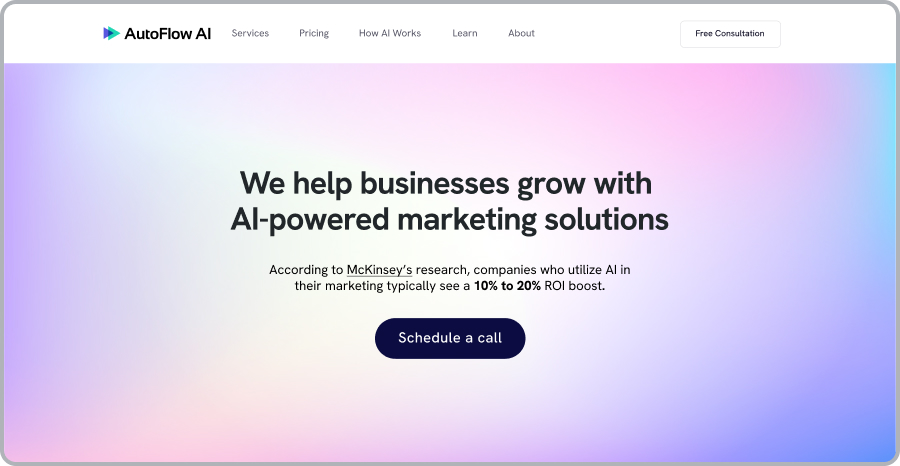
Modern sans-serif font reinforces the software and “buzzword” impression
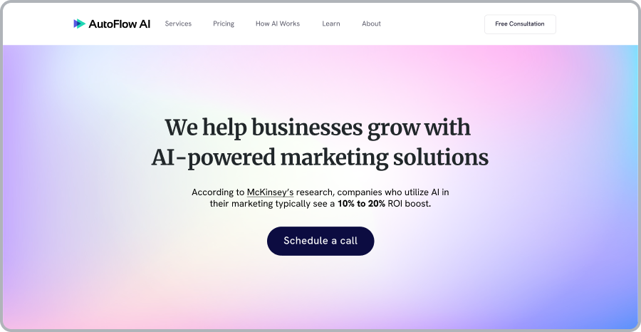
Serif font feels more human and approachable
Design System

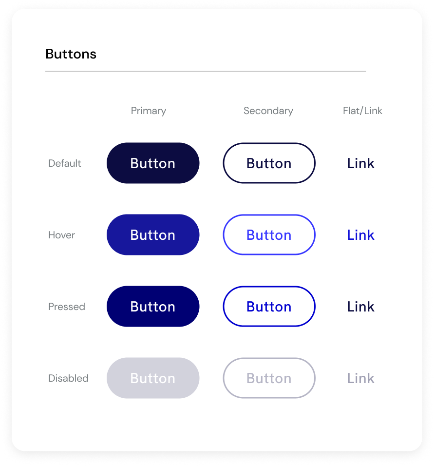
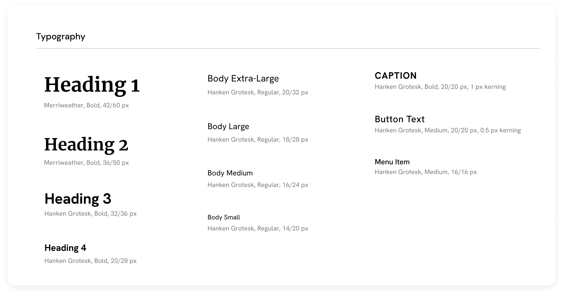
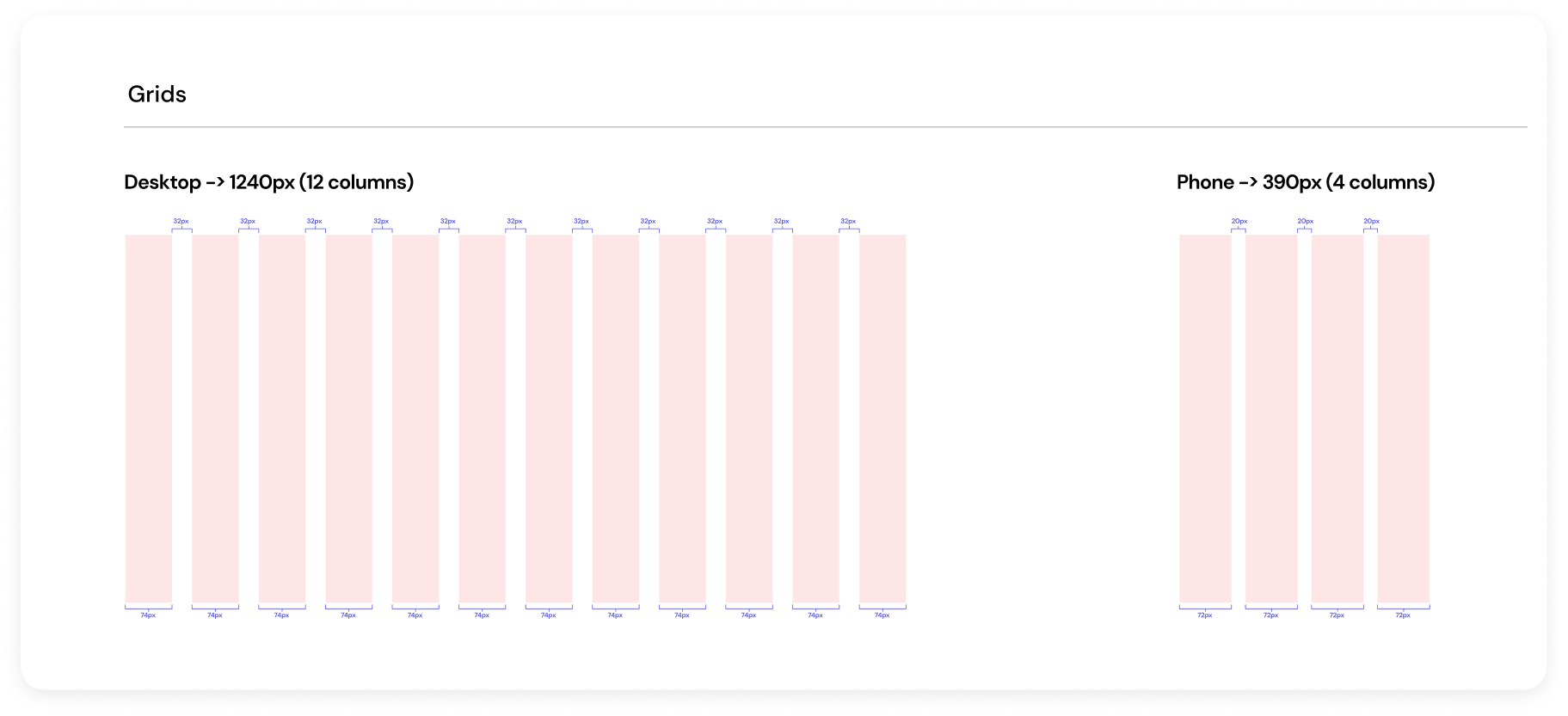
Final Design
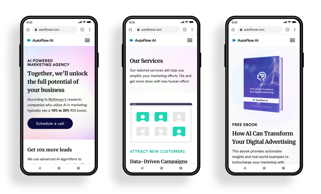
Mobile Version
What I Learned
Going through the entire process of research, defining the problems, brainstorming solutions, conducting usability tests, and crafting final mockups was a valuable experience that illustrated the importance of starting with research before diving into design.
I witnessed how the issues identified during the research phase were pivotal and even re-emerged in the usability tests, underscoring how very significant they were.
Additionally, I got to practice working under a tight timeline and deciding when something is “good enough” to move on from each stage to the next one, rather than becoming entangled in the infinite ways to continue iterating and improving.
Ultimately, I am happy with how this MVP website turned out, and I look forward to seeing how the client continues to evolve his business over time.
Thanks for reading!
Want to talk? Let’s connect and explore how I can help your business provide clear, easy, and delightful digital experiences for your customers.


